Monday, April 26, 2010

State of the Art: Blogging on Maps

There are many different professional blogs about cartography and GIS on the internet. However, blogs are a time-consuming task and I have noticed that several of the professional blogs are intentionally being discontinued by the authors. http://ccablog.blogspot.com/ and http://gis-geoblog.blogspot.com/ are two of the first ones i discovered where the author has announced their intention to discontinue the blog. I don't blame them, blogs are a lot of work and, honestly, do not feel that rewarding (at least to me). There are many other more beneficial activities that could be done in the not-insignificant time it takes to create, write, and maintain a blog. Some of the reasons for stopping a blog include job commitments (making money is always nice) and spending more meaningful time with their families.


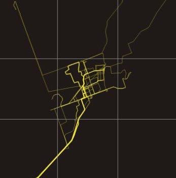
The discontinued cartography blog (http://ccablog.blogspot.com/ )included a post about mapping daily activities. The author mapped his daily vehicle route to work, noting how frequently he traveled on the roads. He mapped each road with a graduated brightness to note how frequently he traveled on them. Here's an example of the map he created


The best and most professional blogs I have read are the ones sponsored by companies, such as ESRI (http://www.esri.com/blogs/index.html). Since the company literally pays them to write the blog (or post the work they are doing for the company), the content tends to be of higher quality and the posts are more frequent. Here is an ESRI blog focusing on geoprocessing (http://blogs.esri.com/Dev/blogs/geoprocessing/default.aspx), especially relevant to this blog due to the work I conducted on the V&T railroad.


The archaeology blog is a very interesting topic and the author has a passion for the subject, posting rich discussions about his work, such as a 3d model of a mill that no longer exists from 1890. This is the next step of geoprocessing, actually modeling and placing the buildings that once existed on the old maps.


Overall, I think the purpose of blogs for GIS should be interesting topics or work that is currently being conducted by the author. Research can be done by anyone on the internet, but showing your own personal or proffessional work and including your commentary on it is unique, that is why the blogs provided by developers are so popular.


Wednesday, April 14, 2010

Mapping Games

Mapping games are an interesting area of interactive, dynamic maps that aid in the learning and understanding of geography. There are many sites devoted to gaming maps, such as http://www.maps.com/FunFacts.aspx and http://www.sheppardsoftware.com/web_games.htm. Most of these games are simply continent, state, country, and capital memorization games. The Sheppard software site also offers landscape maps specific to the regions that the game focuses on.

After more research, I discovered a comprehensive map game that covered many different areas. This game is called GeoNet, http://www.eduplace.com/geonet/ . This game includes many categories including location, physical and human characteristics, physical systems, human systems (population, etc), environment and society, and the uses of geography. However, this game is mostly trivia based and does not focus on the actual reading or understanding of maps.


Sheppard Software offers the most interesting use of map games. The Landscape games are especially interesting. I spent some time playing the United States Geographic Regions game.


This game used narration and visual cues to help the learning process, and provided interactivity on the users part obviously by playing the game. After getting the correction answer in the game, it shows additional information about the place in question. In the screenshot, it is about south central america.


Throughout this search for mapping games, it appears that most developers use several techniques of interactivity to help the learning process. Narration helps the user understand the directions and offer insight into the game. Color is used simply to help in understanding since the games audience is likely to be younger and not interested or require a great level of detail. Extra information about the area, such as the Sheppard Software games, helps understand and visualize the area. I think the most important aspects of these games is that they are intuitive, easy to read and understand, and are generally interesting to play. These aspects should also be the goal of any map project, maybe even moreso when designing a map for a specific audience, where ease of use and understanding may be even more important.

Sunday, April 11, 2010

Recreation and Space Representation in New England

When Discussing New England, I feel that it is first necessary to define exactly what the boundaries are of “New England.” When asked about this, most people don't have an exact definition for New England, other than the ability to distinguish what New England is based on a description, pictures, or a “feeling.” According to Wikipedia, New England encompasses Maine, New Hampshire, Vermont, Massachusetts, Rhode Island, and Connecticut.


Looking at specific recreation guides for New England, such as one guide I have that details the recreation in Western Maine, I have noticed similarities in the way that recreation and space is represented. The theme of most recreation maps for New England centers around nature and the outdoors. Many of the recreation guides include activities such as kayaking, mountain climbing, hiking, sightseeing, etc. New England has is unique in that it has some of the most beautiful and lively landscapes in the country. For example, the fall foliage, cranberry bogs, and landscapes of New England are unique and cannot be found in other parts of the country.


The wealth of history of New England, going all the way from the Pilgrims landing in 1620, attracts many tourists from all over the country as well. Many of the sightseeing and museums are devoted to experiencing the history that was written in the area, such as covered bridges, which are extremely popular and mentioned in many recreation guides.


Overall, I think the “charm of New England” is the combination of the landscapes, history, and wealth of recreational activities available in the area.


MassGIS.gov provides an interesting recreation map for Massachusetts here,

Sunday, March 28, 2010

The Tale of 3 Granvilles

The way communities are named is always an intriguing subject. Two of these towns, Granville Ma and Granville OH have a history. This history involved a disagreement between the citizens of the town, which resulted in a mass emigration. The emigrants of Granville MA created Granville OH. Using epodunk.com, I was able to find population and demographic information.

Granville, MA is a community of 1,521 people whose main ancestry is Irish, English, Polish and German. However, a picture speaks a thousand words.

Granville, MA is a very small rural town with a couple of major arteries running through it. It definitely doesn't appear as successful as the Granville created in Ohio by its former residents.
The Granville in Ohio appears to be doing very well and is easily 2 or 3 times larger than the one in Massachusetts. This community has over 3,000 citizens. Of these citizens, 22% are German, 18% English, and 16% Irish. This ancestry seems to have little correlation with the Granville in Massachusetts, which is slightly odd considering that the origins of the Granville in Ohio is comprised of citizens from the Granville in Massachusetts. The citizens of Granville Ohio are also more prosperous than those in Granville Massachusetts, with median household incomes of $67,000 in Iowa and $53,000 in Massachusetts.

The Granville in Iowa has no history with either of the other two. With only 325 citizens, it also doesn't compare on an economic and prosperity level. In fact, Granville, Iowa has the lowest median income of $33,000. However, an interesting similarity between the Iowan Granville and the Ohioan Granville is the German ancestry. The Ohio Granville has a German ancestry of 22% and the Iowa Granville has a major German ancestry of 51%! Granville, Iowa is obviously a farming community and is probably the occupation of most of the citizens.

The three communities do share some similarities; they are all relatively low population, are mostly rural, and are fairly isolated. Research into the history and formation of these three communities may prove fruitful and may uncover the reason why 2 communities with a history and 1 disparate community have the same name. Here is a good map showing the location of all three in the United States.

Sunday, March 21, 2010

Mapping the News

Mapping the news is a very broad topic and is pervasive in every form of coverage. This includes weather reporting, news stories, geographic events (such as the recent earthquakes), and other forms where a visual representation can result in better understanding of the news. The most obvious uses for maps in the news are for weather, and dynamic maps can be seen every day behind the meteorologist. A good example of mapping news in a common way can be seen at http://seattletimes.nwsource.com/flatpages/local/mappingthenews.html. The Seattle Times uses a GoogleMaps plugin to map the locations of their various news stories. This can help increase the understanding of why the events occur in relation to where they occur.


However, mapping the news does not just have to be limited to the linear “showing the location of something” formula. Marcos Weskamp,

a design engineer specializing in information visuali

zation, has created a remarkable program to map the news.


It is best understood in his own words,

“Newsmap is an application that visually reflects the constantly changing landscape of the Google News news aggregator. A treemap visualization algorithm helps display the enormous amount of information gathered by the

aggregator. Treemaps are traditionally space-constrained visualizations of information. Newsmap's objective takes that goal a step further and provides a tool to divide information into quickly recognizable bands which, when presented together, reveal underlying patterns in news reporting across cultures and within news segments in constant change around the globe.”


Needless to say, this is an amazing piece of technology that is very interesting to use. The program runs in your browser and can be found at this url, http://newsmap.jp/

Give it a try! I spend quite a while looking at both national and international news and came across some very interesting articles.


Wednesday, March 3, 2010

Mapping the V&T Railroad

After Georeferencing several tax assessor maps from the 1918's, I was able to map part of the V&T Railroad. Here are the results layered into Google Earth. As you can see from close-ups of the railroad, the measurements are not exact. This could be explained from errors from the old tax maps or from the coordinate systems used for georeferencing.
Nevertheless, these maps show several interesting geographical features that occured almost 90 years later.
Here are the results:


The Impact of Weather on the Geography of the Planet

As I was researching about mapping history, I discovered research conducted by Boose, Chamberlin, and Foster for the Ecological Society of America. They created a system to analyze the impact of hurricanes on the environment going back several centuries. This system is able to show wind damage, erosion, and several other factors relating to hurricanes and other storms. In this article, the authors analyzed New England hurricane and map data going all the way back to the 1620’s. Through the research, they were able to map forest and building damage, frequency of hurricanes, and many other factors. Here are some examples of their research,


The most interesting aspect of the system they created is the ability to apply it to any area that has sufficient historical records. Although the amount of work is extensive, the authors have already applied their system to several other areas, such as Puerto Rico. This unique system could provide valuable insight into hurricane damage prevention and how these storms impact the environment. The only way the authors’ system can work is through the historic maps that were created centuries ago, and therefore applies very well to ‘Mapping the Historic’.


Monday, February 8, 2010

GIS and Planning, a Better Alternative to "eyeballing it"

After reading the "Introduction to Urban and Regional Planning" in the ArcGIS training course, one specific section really interested me. The page where they discussed the difference between reactive and proactive planning was especially intriguing.

Proactive planning is done to help prevent a problem, such as creating a traffic management system before it becomes a problem, or creating a sewage system that allows for easy expansion. Reactive planning would be how we are trying to help the environment now. The damage has already been done and now we are trying to minimize and reverse the damage.

I believe proactive planning is one of the major goals of regional and urban mapping. It is much easier to see a future problem using a map, and correcting it, than having the problem occur and trying to fix it then.

A new and interesting development in urban planning is a 3D modeling system that Placeways has developed called Scenario3D. This program is an extension to ArcGIS and allows a map-maker to create a street-level view of an environment, such as a neighborhood or shopping mall. This could be very helpful in the instances where an overhead view hides problems that are presented from the height of buildings or areas that could introduce crime that are not visible from an overhead view. Here is a sample picture from the program;

Sunday, January 31, 2010

Social Explorer (And that old addage that 'nothing is free' still holds true)

I played around on this website for a good half hour just looking at how population has changed in the last 100 years. I kept changing the years to see where people were migrating too and things like that. Unfortunately, my interest wained shortly after I stopped playing with the population, because in the free version, that is the only parameter that can be looked at. Honestly, I would have expected a few more options available to those who do not wish to pay for a subscription. I probably would have complained about the price of the subscription, but it is strangely not publicized on their website.


I found the demographic information for New York City from 1940 to 2000. I thought it would be interesting to look at the black population centered around the Bronx. However, this brought me to my next problem. The plague of reduced features makes it virtually impossible to export maps as images, without some fancy Paint work that I would rather not do. Instead, I created links!

Bronx African American Population

1940

1950

1960

1970

1980

1990

2000

As you can see from the maps above, there were very few African Americans in the Bronx in 1940. By 2000, there are two distinct areas of heighted population to the northeast and southwest.

After thinking for a bit about population mapping and criminal justice, it would make an interesting project to map how population increases affect crime rates with respect to both the raw population numbers as well as demographic data.

Overall, I think the website is a valuable source of information, especially when it can be exported to other programs. The map utility that they use to access their data is cumbersome and inefficient though. The controls are unresponsive and the map window is so short and wide that it is difficult to place the map in a position that provides any relevant information. Combine that with the wealth of inaccessable features on the free version and it is nearly impossible to do anything more meaningful than playing around.

Tuesday, January 26, 2010

Mapping Music That Sounds Good

I found this really interesting theory to map music while searching on Google. Tymoczko, a composer taking up residence at the Radcliffe Institute for Advanced Study, found a way to map music that sounds pleasing to the human brain. The actual element of music that makes it enjoyable has remained a mystery, despite resources such as sheet music. Tymoczko used non-Euclidian geometry to create an object called an orbifold. Shown in the picture below, this complex mathematical figure allows Tymoczko to map chords that sound pleasing to the human ear. Chords that sound good are mapped inside the orbifold, while those that do not are placed farther away.

Tymoczko hopes that his invention will be used to help schoolchildren better understand music. He also envisions developing computer programs that can analyze and compose music that sounds good, as well as creating instruments which make it easier to play music that sounds good. Heres an example of E-minor mapped using this technique:


I feel this is a pretty significant breakthrough. Since the creation of music, no one has known exactly why certain notes and chords are appealing while others are annoying and painful. It will be interesting to see how this discovery is going to be used, whether to create music that is tailored to use chords that all sound good or to even create new instruments as Tymoczko suggests.

Source: http://harvardmagazine.com/2007/01/mapping-music.html